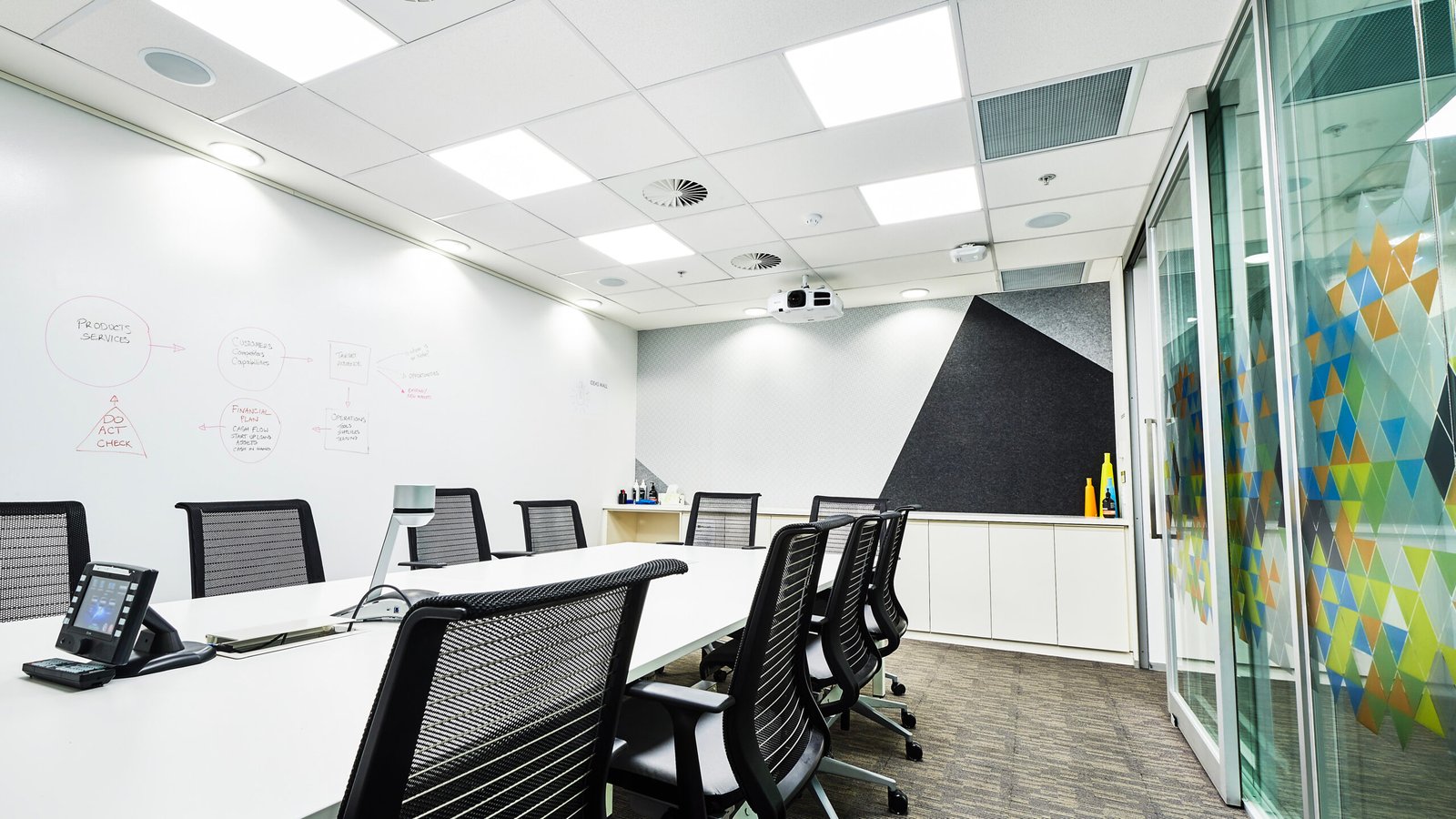
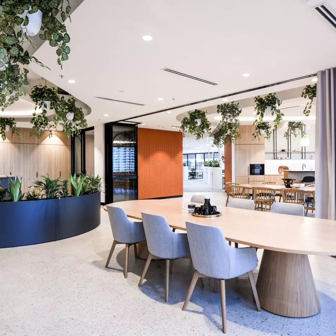
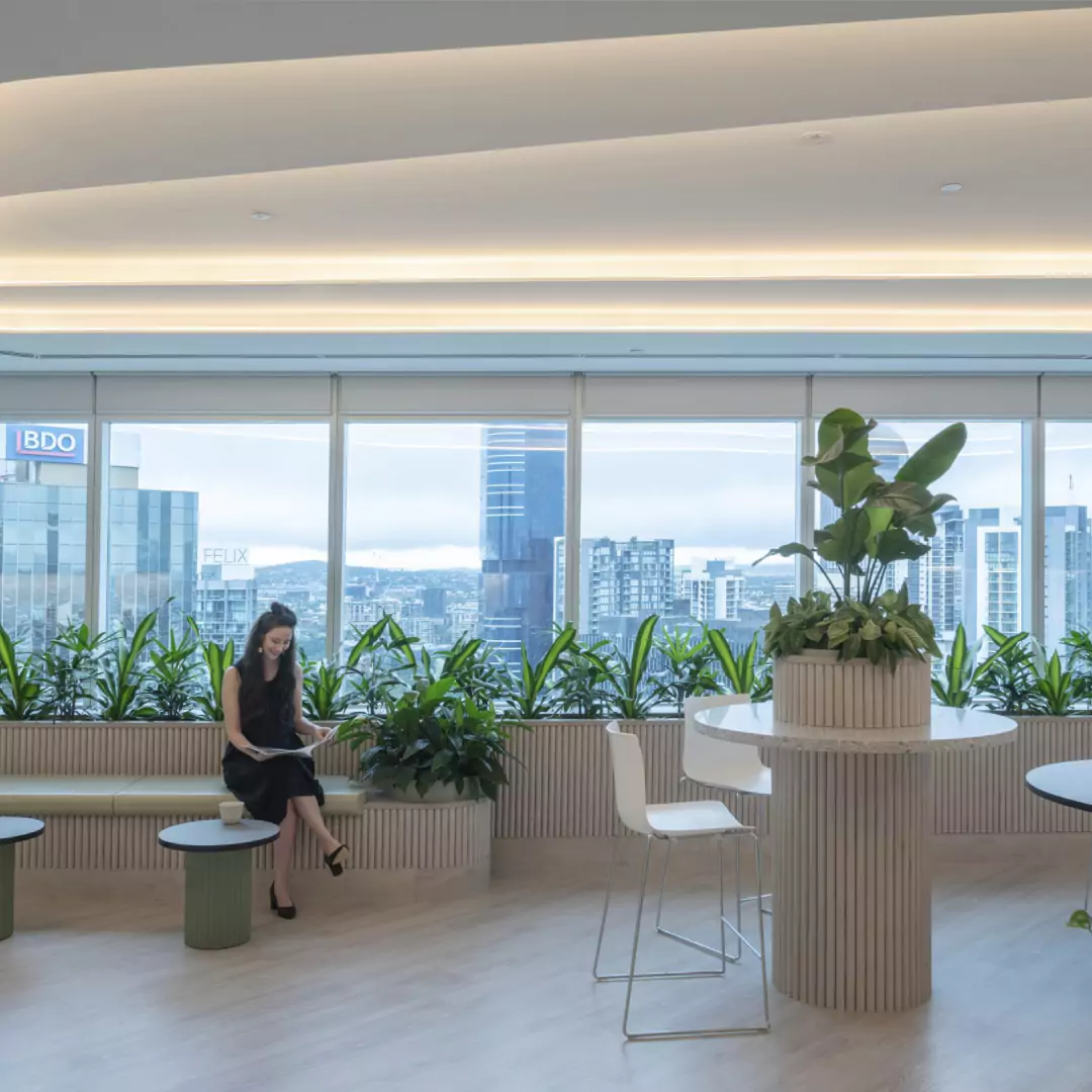
IA Design was engaged by Aurora for the upgrade of Microsoft’s existing and ‘dated’ head office in Perth. Key drivers of the project were to create a contemporary and sophisticated space that represented Microsoft and provided a great first impression for clients, staff and visitors, all while providing a space that could accommodate their frequent influx for large meetings.
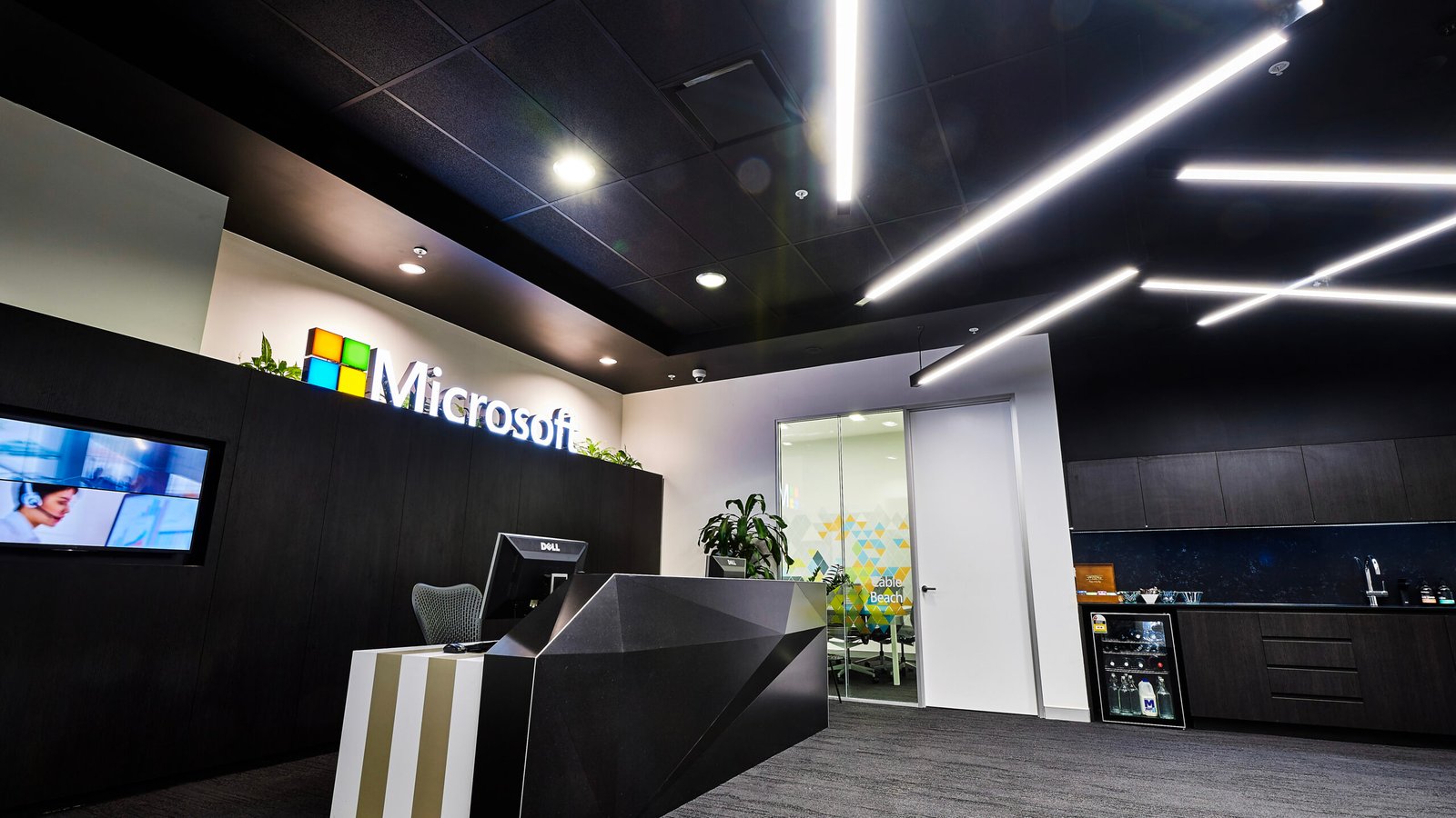
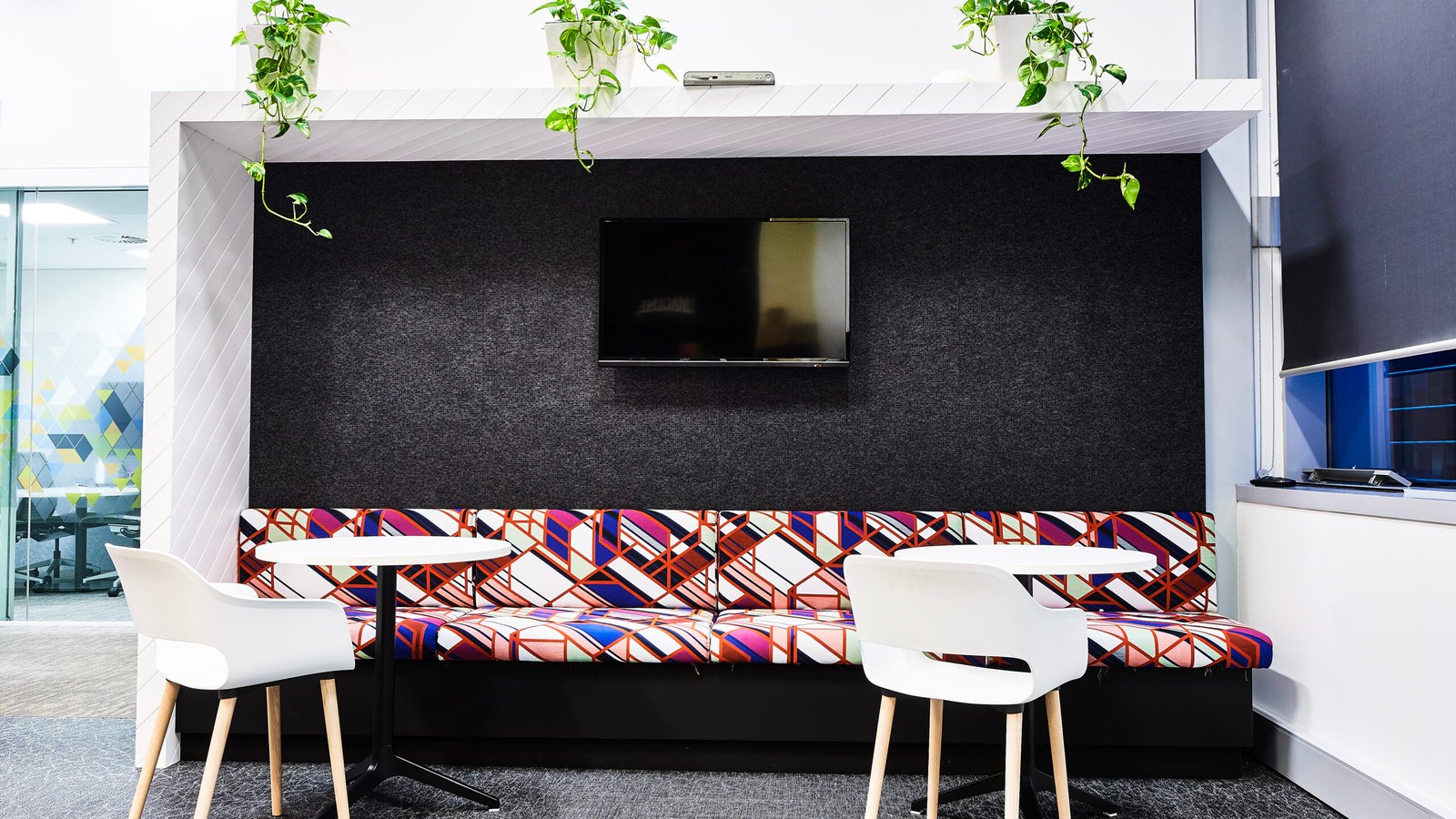
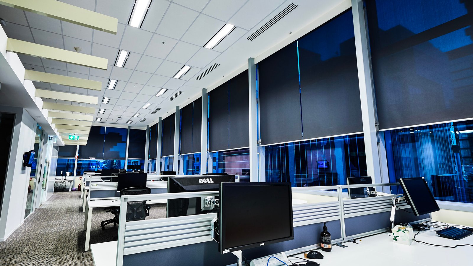
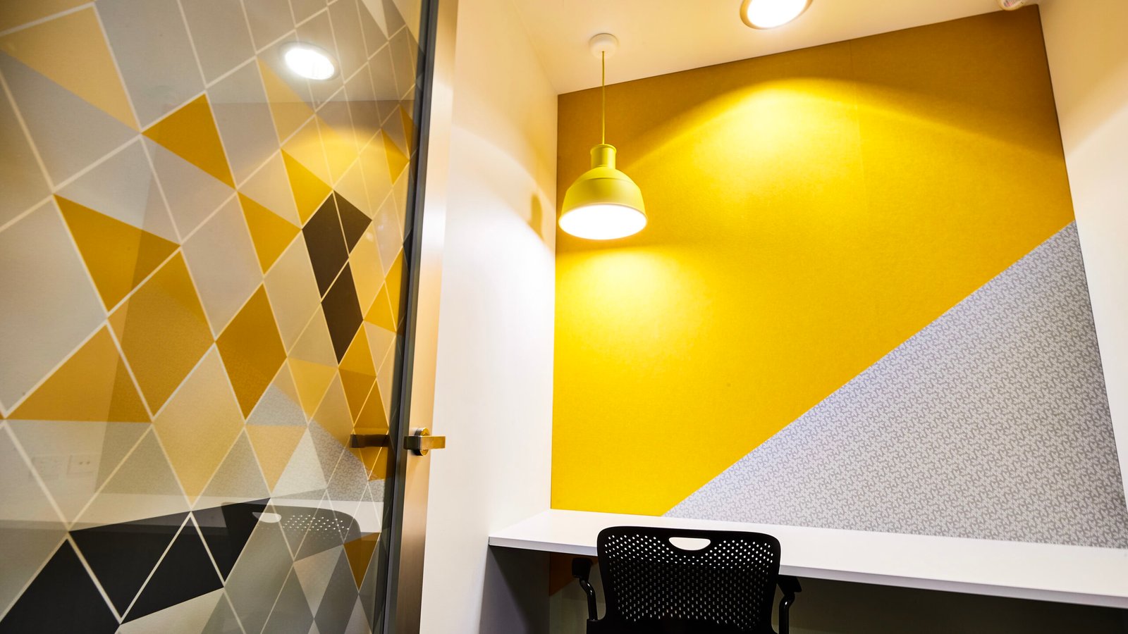
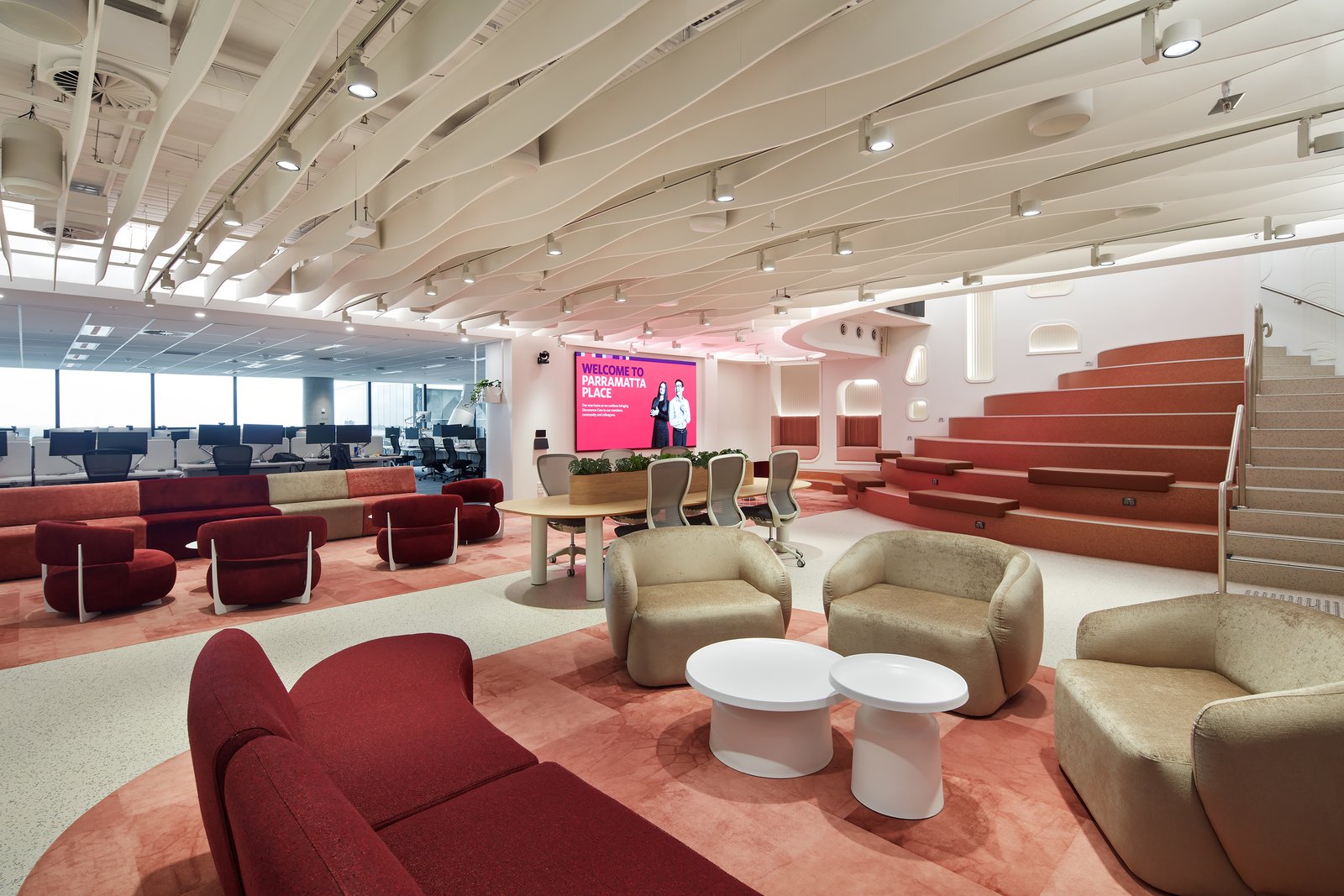
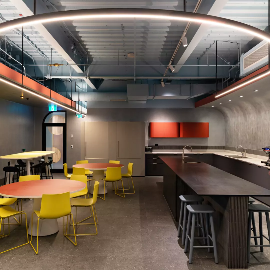
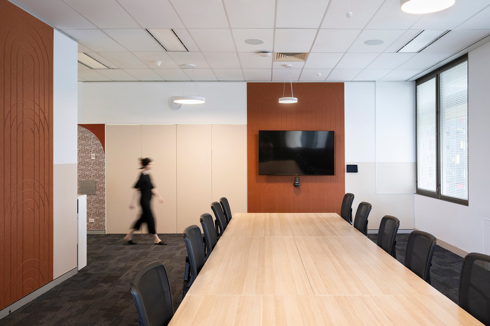
Microsoft required the Front of House to be ‘opened up’ as an inviting and contemporary space that could accommodate visitors and guests. IA Design had to ensure they designed the space whilst keeping in mind that when guests and visitors were not using the space it would need to be viewed as a normal reception area. A sleek colour scheme was selected with black being the main feature, this ensured the large space was a stylish first impression whilst making it feel more inviting. Throughout the remainder of the tenancy a timeless palette was selected that is sympathetic to the Microsoft branding. A generous breakout with a collaborative area was created, with splashes of colour in upholstery finishes.
IA Design was required to adhere to a tight time frame with 4 weeks for construction and a short lead time, whilst a minimal budget needed to be abided by. This was all successfully achieved whilst working with one client who was based in Sydney, and one who was based in Singapore.
